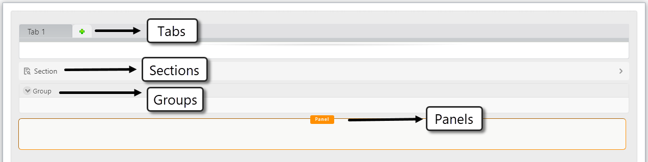
Containers: Tabs, Groups, and Panels
Containers enable you to organize the Display area to arrange the information in Tabs, Groups, or Panels.
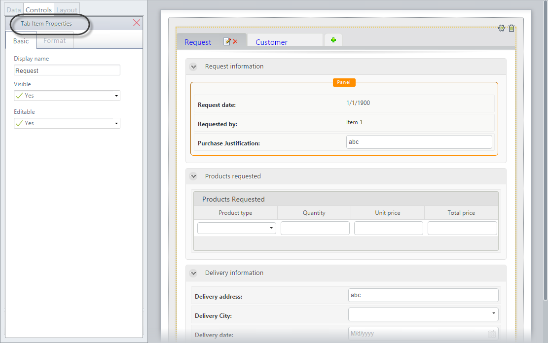
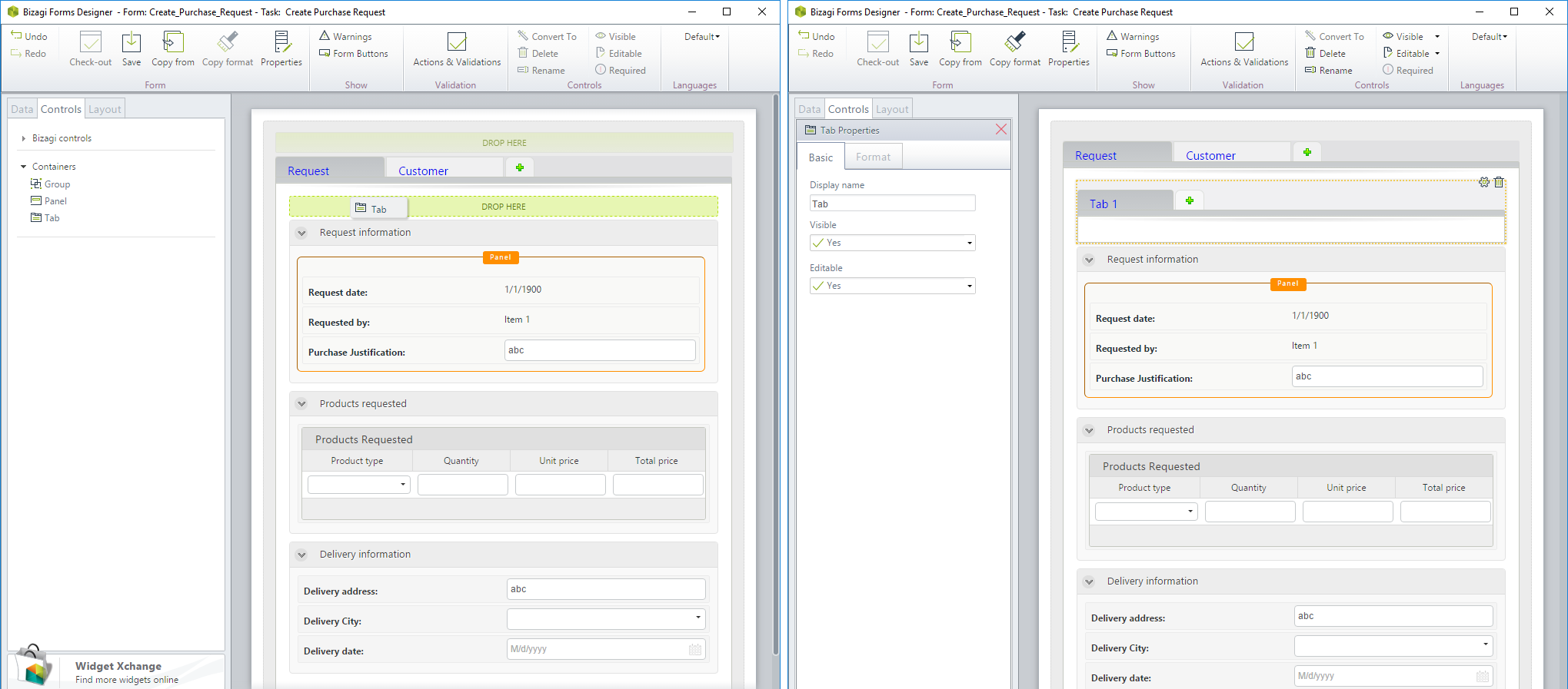
Tabs
Tabs look and behave similarly to the tabs of a Web browser. The selected tab displays its content, and the content in all other tabs remains hidden.
Note:
To preserve performance, controls added to the first tab are loaded as soon as Bizagi displays the form. Controls added in the second tab are loaded either when the tab is accessed (when the user opens the tab) or ten seconds after Bizagi displays the form. If you use Actions, validations, or On Enter actions over controls added to the second tab or to others, those actions may fail if the controls have not been loaded.
Groups
Groups arrange the controls in blocks, visually organizing them into small sets of related information.
Panels
Panels group controls that are positioned next to each other in a form, enabling you to affect them as a whole in Actions & Validations, instead of making individual actions for each one. Please refer to Affecting several controls to view an example.
Container Properties
All the containers are available for both desktop and mobile forms. The containers have the following properties:
- Display Name
- Visible
- Editable
The last two Boolean properties can be set to:
- True

- False

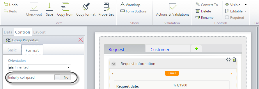
Additionally, groups have a special property called Initially Collapsed, which defines if the group will initially be shown as expanded or collapsed.
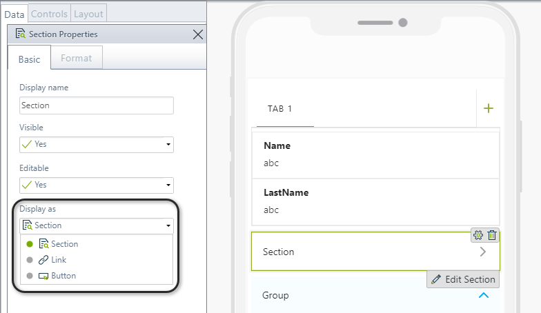
Section Properties
Sections have a special property called Display as, which defines how the section is displayed in the form: as a section, link, or button.
Control Inheritance
Every control in the container will inherit the property values assigned to the container (Tab, Group, or Panel).
For example, if a Panel is set as not editable, every control in the group will also be non-editable, regardless of the configuration of the individual control.
That is, the container has seniority over the controls in the visual hierarchy.
Renaming a Container
To rename a container, double-click its name and type the desired name. Click on the green Save icon to finish editing.
To delete a container, select it and click the red Delete icon attached to the boundary of the control.
Container Nesting
All containers can be added inside each other. For example, a tab can be inside a group, a section inside a panel, and vice versa. You can create any needed combinations.
- A Group within a Group
- A Tab within a Tab
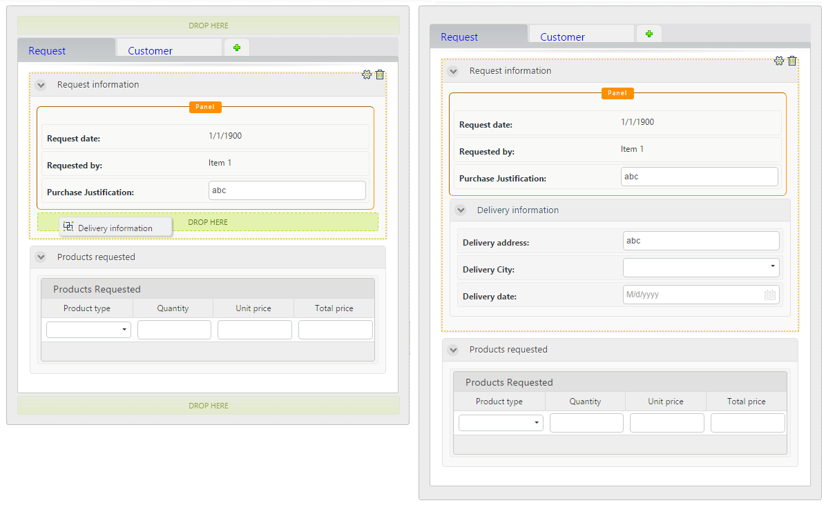
- A Section within a Section
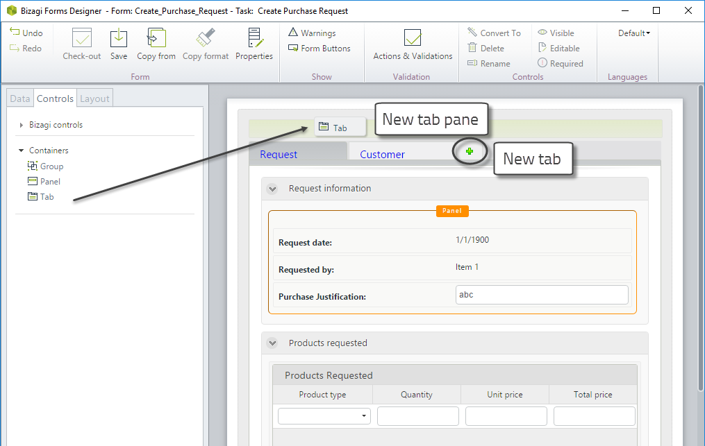
Create a New Tab
When you include a Tab in a form, the green Add icon is always available on the right. This icon allows you to include new tabs next to each other.
If you drag and drop a new tab from the Containers, it will not be placed alongside an existing one, but as a new tab in a separate pane.